Ladies, Wine & Design
Brand Design
Graphic Design
Art Direction
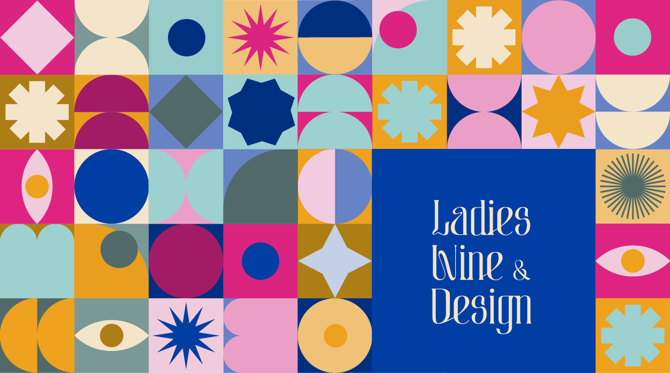
Ladies, Wine & Design is a non-profit initiative that operates globally with chapters in 280+ cities around the world.
It was established by Jessica Walsh with the aim of promoting diversity in creative leadership roles.
LW&D provides mentorship circles, portfolio reviews, talks and creative meet-ups for underrepresented creatives. The organization welcomes women, non-binary, gender and non-conforming gender individuals with open arms.

Upon joining the Copenhagen chapter, I was out to imagine how a new brand identity could look like.
Inspired by the founder’s values of knowledge-sharing and empowerment, I sought to create a brand with a strong, dynamic and cheerful identity.
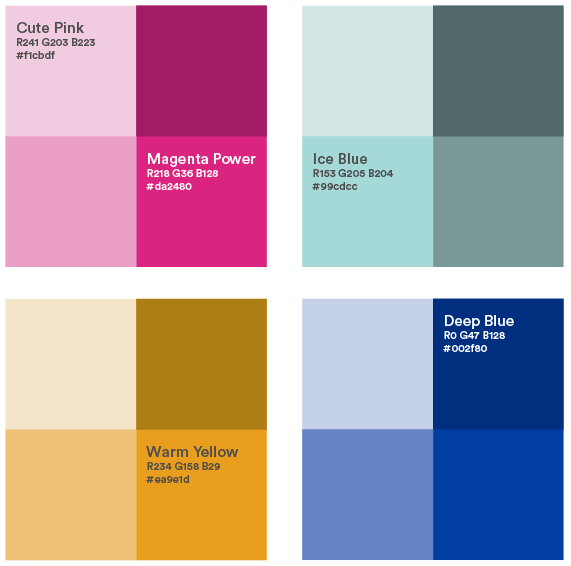
The Colour System is composed by 5 main colours. 16 variants in total that better represent the concept behind the key-words:
. Sparkly
. Fluid
. Warmth
. Empowerment
. Flavourful
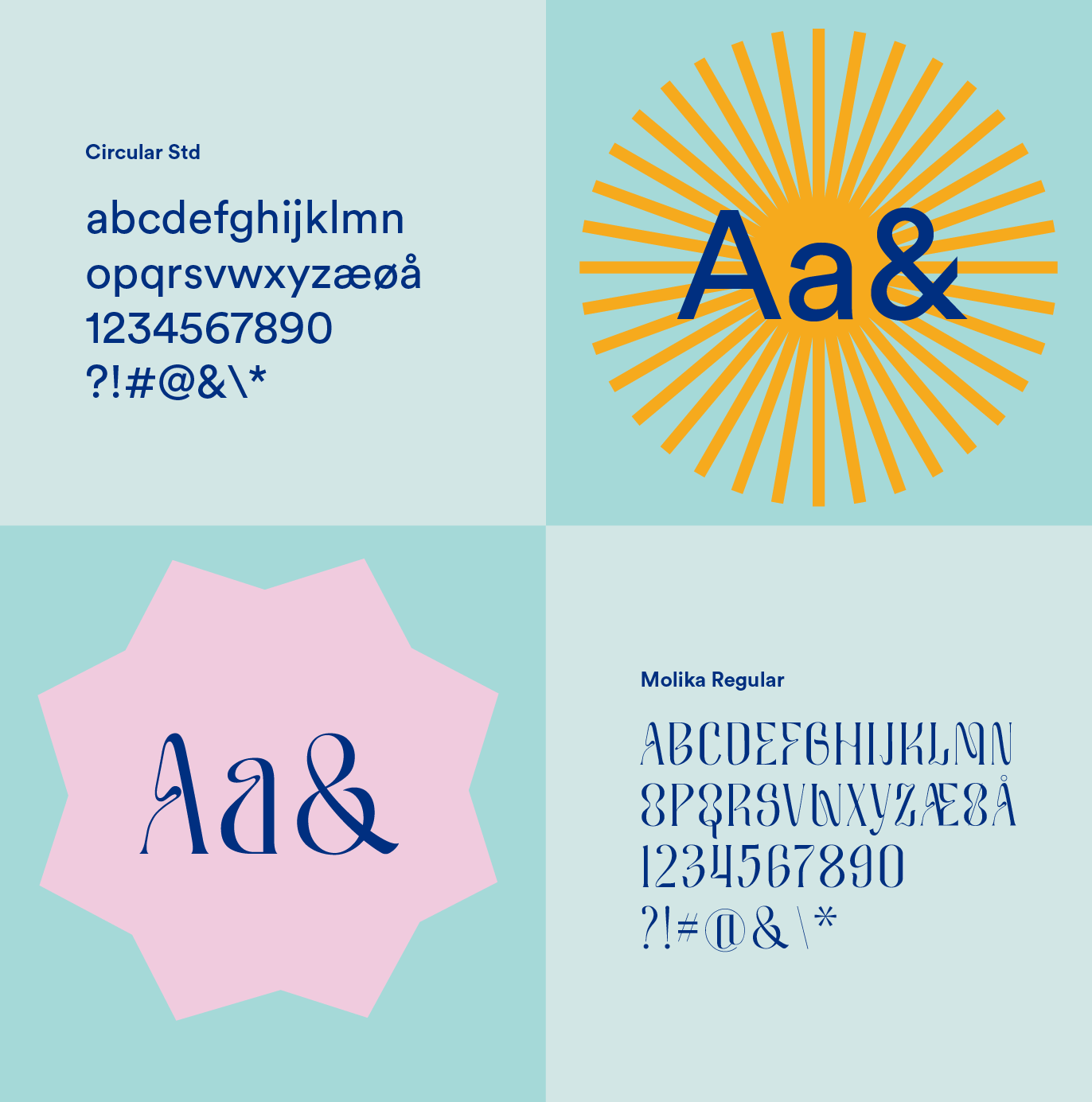
The typeface Circular Std is the one used by the original LW&D in order to create a connection with the new chapter. Molika Regular, in contrast, was selected to represent the idea of flexibility and warmth.
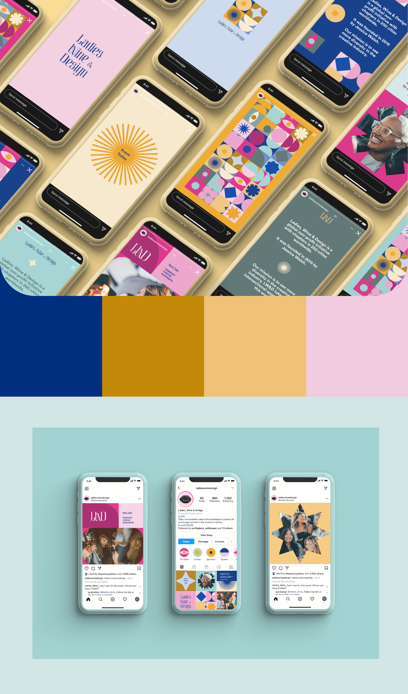
SoMe - Instagram Stories and Posts
The structure allows for an infinite creation of templates for Social Media, with the emphasis on Instagram stories and posts.
Merchandise
Staff tags, T-shirt and Stickers
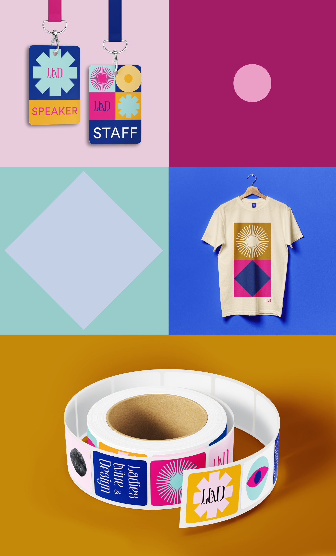
The geometrical structure of the brand was designed with teamwork in mind. All team members are encouraged to create new visual combinations that best suit each situation.
The possibilities are endless, making LW&D a dynamic and in constant development brand.
